Vorlesta: A Bold Display Font for Distinctive Web Identity
As a UI designer who ships dozens of landing pages, SaaS dashboards, and e-commerce sites each year, I treat fonts like foundational UI components—not just decoration. Vorlesta stands out in my toolkit because it’s a display font that delivers personality without sacrificing clarity or intention. It’s not a workhorse body typeface, and it’s not meant to be. Instead, Vorlesta is the confident voice behind your headline, the visual signature in your hero section, the spark that makes a boutique brand feel instantly memorable.
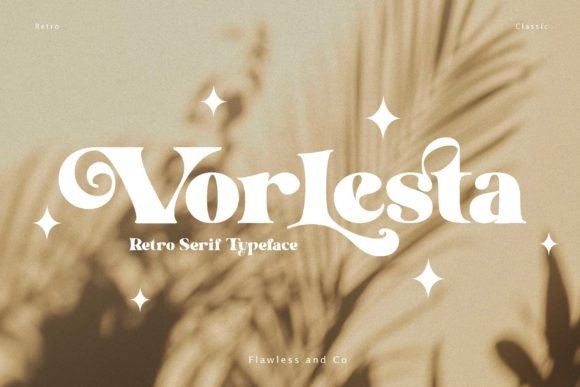
Vorlesta blends modern structure with retro warmth: clean geometric shapes meet subtle hand-drawn imperfections—slight tapering on terminals, gentle asymmetry in curves, and a relaxed rhythm that avoids robotic rigidity. The letterforms carry boho energy but stay grounded enough for digital use: no excessive flourishes, no fragile thin strokes, and generous x-heights that support legibility even at smaller display sizes. It’s a premium font built for screens, not just print.
Where Vorlesta Earns Its Place in Your Layout
In web design, Vorlesta works best where impact and tone matter most—not as paragraph text, but as strategic typographic punctuation. I consistently reach for it in these high-impact zones:
- Hero section headlines — On a coaching website or creative portfolio, Vorlesta sets an inviting, human-centered tone before the first sentence loads.
- Landing page CTAs — Paired with ample whitespace and contrast, “Start Your Journey” or “Get Early Access” gains warmth and approachability without losing urgency.
- Online store banners — For a handmade goods shop or wellness brand, Vorlesta adds craft-driven authenticity to seasonal promotions or limited-edition announcements.
- Course or product launch graphics — Used over soft gradients or muted photography, it signals creativity and intentionality—key for conversion-focused education sites.
- Logo lockups and brand kits — Its strong character silhouette holds up well across favicons, app icons, and social profile headers.
Readability & Responsiveness: Practical Considerations
Vorlesta performs reliably across devices—but only when used intentionally. On desktop, it shines at 36px and above. On mobile, I cap usage at 28px for headlines and avoid sub-20px entirely—even with its generous x-height, fine details soften on small viewports. For dark backgrounds, I always test contrast: Vorlesta’s medium weight reads cleanly against charcoal or deep navy, but ultra-light variants may need adjustment or fallbacks.
When layered over imagery—especially textured or busy photos—I add a subtle semi-transparent overlay or light text shadow to preserve legibility. No drop shadows, no heavy outlines: just enough lift to ensure the message lands first.
Font Pairing That Supports, Not Competes
Vorlesta thrives in contrast. I pair it almost exclusively with neutral, highly legible sans serifs: Inter, Manrope, or Poppins for UI-heavy apps; Montserrat or Lato for marketing sites. These pairings create clear visual hierarchy—Vorlesta commands attention, while the supporting type handles scanning, navigation, and dense content without strain.
For editorial or lifestyle brands, I occasionally pair Vorlesta with a warm serif like Cormorant Garamond or Playfair Display—but only for blog headers or quote callouts, never body copy. The goal isn’t stylistic harmony for its own sake; it’s functional contrast that guides the eye and supports user goals.
Technical Fit for Real Projects
Vorlesta ships as a webfont-ready package with WOFF2 files, multiple weights (Light, Regular, Bold), and OpenType features including ligatures and stylistic alternates—useful for avoiding repetitive letter combinations in short headlines. It includes Latin Extended-A support, covering most Western European languages, though full Cyrillic or Arabic coverage isn’t included. Always verify multilingual needs before licensing.
Crucially, Vorlesta is licensed for commercial web use—including client sites, SaaS platforms, Shopify themes, and digital templates you sell. That means embedding via @font-face, using it in Figma design systems, or exporting as part of a branded component library—all permitted under standard licensing. Just confirm whether your use case requires extended licenses for unlimited domains or white-label distribution.
Brand Tone Starts With Typography Choice
Your font choices quietly shape how users perceive trust, creativity, and professionalism. Vorlesta doesn’t say “corporate” or “minimalist”—it says “thoughtfully crafted,” “human-led,” and “intentionally expressive.” That matters when users decide whether to scroll, click, subscribe, or buy. A boutique skincare site using Vorlesta in its hero doesn’t just look different—it feels more personal, more tactile, more aligned with values like care and authenticity.
I’ve seen Vorlesta elevate a freelance designer’s portfolio by reinforcing their hand-drawn illustration style, help a yoga studio’s online course page feel grounded yet inspiring, and give a zero-waste brand’s newsletter banner emotional resonance that plain sans serifs couldn’t match. In each case, the font didn’t distract—it clarified.
That’s the real value of a well-chosen display font: it reduces cognitive load by making tone unmistakable at a glance. Vorlesta earns its place not because it’s trendy, but because it solves a specific design problem—how to communicate warmth, confidence, and individuality within the constraints of the web.