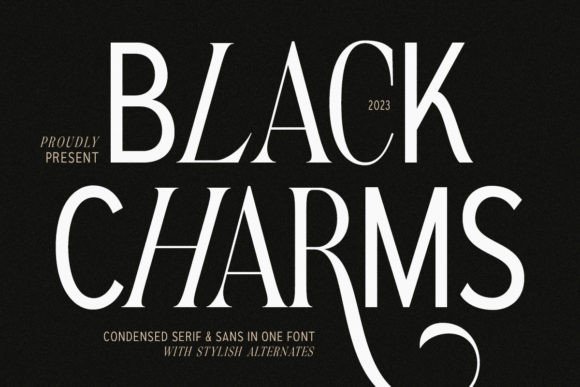
Black Charms: A Display Font That Shapes Digital Identity
As a UI designer who ships landing pages, SaaS dashboards, and boutique e-commerce sites, I don’t reach for display fonts lightly. They’re not background players—they’re tone-setters, hierarchy anchors, and silent brand ambassadors. Black Charms is one of the few display fonts I’ve added to my core toolkit because it balances boldness with clarity—and does so without sacrificing digital legibility.
Visually, Black Charms blends clean sans-serif structure with subtle serif flourishes—think sharp terminals on uppercase “T” or delicate bracketed stems on “H” and “E.” It’s not a script font, nor is it purely geometric. Its rhythm sits comfortably between modern minimalism and editorial warmth. The contrast isn’t high like a slab serif, but it’s intentional: enough to guide the eye, not enough to distract from content. That makes it unusually versatile for real-world web use—not just mockups.
In hero sections, Black Charms excels at establishing voice before users scroll. A single-line headline like “Design With Intention” or “Your First 100 Customers” gains weight and character without needing animation or oversized spacing. On mobile, I use it at 32–40px with generous letter-spacing (0.05em–0.08em) and always pair it with a highly legible sans-serif body font—like Inter or Manrope—for immediate readability below the fold.
For conversion-focused layouts, I reserve Black Charms for high-impact, short-text zones: CTA buttons (“Start Free Trial”), section headers (“What You’ll Build”), pricing plan titles (“Pro Plan”), and testimonial pull-quotes. It doesn’t work well for paragraphs or long navigation labels—but that’s by design. As a display font, its strength lies in signaling importance, not sustaining reading flow. Using it sparingly keeps visual hierarchy intact and prevents tonal fatigue.
Online stores benefit especially. A boutique fashion site might set product category banners (“Handcrafted Leather,” “Limited Edition”) in Black Charms over muted image overlays—its contrast holds up well against soft gradients or desaturated photography. For dark-mode interfaces, I adjust the font color to #e0e0e0 instead of pure white to reduce glare, and always test rendering across Chrome, Safari, and Firefox. Webfont loading is smooth—it comes in WOFF2 format, and the variable axis supports optical sizing for responsive scaling.
Brand consistency is where Black Charms shines beyond aesthetics. When used across a portfolio site’s logo lockup, course sales page headlines, and email header graphics, it creates a throughline—even without color or iconography. That’s critical for solopreneurs and micro-brands building recognition across fragmented touchpoints. I’ve seen coaching websites use it for session titles (“Clarity Call,” “Strategy Sprint”) and maintain strong recall across Instagram carousels and Notion-branded onboarding flows.
Readability on small screens demands intentionality. I avoid using Black Charms under 24px on mobile, never for button labels smaller than 140px wide, and never as the sole text on low-contrast backgrounds (e.g., charcoal gray on black). On light backgrounds, #2d2d2d works better than pure black for reduced visual vibration. For image overlays, I apply a subtle semi-transparent dark scrim behind the text—not just a text shadow—to ensure consistent legibility across devices.
Font pairing is non-negotiable with any display typeface. My go-to combination: Black Charms for headings and accents + Inter (or IBM Plex Sans) for body, captions, and interface labels. This pairing delivers contrast without clash—clean, neutral, and engineered for screen readability. For editorial or creative agency sites, I sometimes swap in a warm serif like PT Serif for blog post titles, letting Black Charms handle only the most prominent brand-facing moments: logo subhead, newsletter banner, or featured project tagline.
The type family includes regular and bold weights—no italics or condensed variants—but that’s fine. Its purpose isn’t flexibility across every typographic need; it’s precision in high-impact roles. It supports Latin-based languages (including extended diacritics), which covers most English, Spanish, French, and German use cases. If your audience includes Turkish or Vietnamese users, verify glyph coverage before launch—but for 90% of SaaS, creator, and e-commerce projects, it’s fully functional.
Licensing is straightforward but essential to address: Black Charms is a commercial font, meaning you’ll need a web license for live domains, client sites, or hosted apps. One license typically covers unlimited pageviews and domains under a single entity—but if you’re selling templates on ThemeForest or distributing a Figma UI kit, confirm whether the license permits redistribution. Never self-host a font without verifying usage rights; browser console warnings aside, inconsistent rendering and legal exposure aren’t worth the shortcut.
In practice, Black Charms performs best when treated like a design system component—not decoration. I use it in Figma auto-layouts with fixed text styles, assign it semantic tokens (e.g., “heading-1-display”), and document usage rules for clients: “Use only for primary headlines, branded CTAs, and campaign-specific banners. Never for body copy, form labels, or data tables.” That discipline ensures it elevates rather than overwhelms.
Whether you're refining a founder’s personal brand, launching a new course platform, or polishing an online store’s seasonal campaign, Black Charms offers a rare blend: personality with precision, flair with function. It doesn’t try to be everything—it commits to being exceptional where it matters most: first impressions, emotional resonance, and unmistakable digital presence.