Lemon Mocktail: A Bold Display Font for Retro-Inspired Web Design
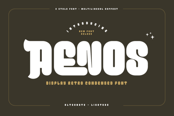
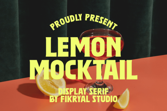
Lemon Mocktail isn’t just another decorative typeface—it’s a deliberate design decision. As a display font built for impact, it carries sharp edges, confident contrast, and a vintage sensibility that reads as both nostalgic and intentional. Its letterforms are tightly spaced, with strong serifs and angular terminals that command attention without sacrificing legibility at scale. For web designers and UI creators, Lemon Mocktail works best where visual hierarchy meets brand voice: hero headers, product launch banners, course landing pages, and boutique e-commerce signage.
This font thrives in short-form, high-impact contexts—not body copy, not navigation menus, not small mobile buttons. Think of it as your typographic spotlight: ideal for a headline like “Summer Collection Is Here” on an online store banner, or “Your First Coaching Session” atop a conversion-focused landing page. Its personality is bold but not chaotic; retro but not kitschy. That balance makes it especially effective for brands leaning into authenticity—creative studios, indie makers, wellness practitioners, and lifestyle blogs aiming for warmth with structure.
On the technical side, Lemon Mocktail is optimized for web use. It ships as a modern WOFF2 webfont, with fallback support for standard browsers and responsive environments. When implemented via @font-face or a trusted font host, it loads quickly and renders crisply across devices. On mobile, keep usage to larger headings (32px and up) and avoid tight line heights—its sharp geometry benefits from generous spacing. For dark backgrounds, ensure sufficient contrast (at least 4.5:1 against #121212), and consider subtle text shadows if overlaying on complex imagery.
Readability in digital interfaces depends less on ornamentation and more on context—and Lemon Mocktail delivers when used deliberately. It doesn’t compete with content; it frames it. A visitor scanning a landing page will lock onto a Lemon Mocktail headline before reading supporting copy—and that split-second recognition helps guide attention toward CTAs, value propositions, or visual anchors. That’s why it pairs so well with clean sans serif fonts like Inter, Manrope, or even system fonts like -apple-system for body text: the contrast reinforces hierarchy while keeping cognitive load low.
For branding consistency, Lemon Mocktail serves as a reliable tone-setter. Use it across key touchpoints—your homepage header, email campaign subject lines, social media cover graphics, and downloadable brand kits—to signal creative confidence and editorial polish. It’s equally at home on a minimalist portfolio site (“Work” section header) and a vibrant online shop banner (“Handcrafted • Small Batch • Made With Care”). In each case, it communicates craft, intention, and human-centered design—not algorithmic trend-chasing.
Font pairing matters most when balancing personality with function. Lemon Mocktail’s strong presence means it needs breathing room and typographic counterweight. Pair it with a neutral, highly legible sans serif for paragraphs and interface labels—something with open apertures and consistent x-heights. For editorial or luxury-leaning sites, try a refined serif like Crimson Pro or Lora for subheadings or pull quotes. Avoid pairing it with other high-contrast display fonts or script fonts—visual clutter dilutes its retro authority. And never force it into small UI elements: skip using it for form labels, tab titles, or microcopy. Reserve it for moments that earn emphasis.
When integrating Lemon Mocktail into client projects or SaaS dashboards, verify licensing terms upfront. As a commercial font, it typically includes web embedding rights for live domains, but check whether your license covers unlimited domains, template resale, or white-label usage. Some versions include stylistic alternates (like swash capitals or ligatures) that add nuance to logo lockups or hero visuals—test those in real layouts before finalizing. Also confirm multilingual support: while Lemon Mocktail covers Latin-based languages thoroughly, double-check glyph coverage if your audience includes extended diacritics or non-Latin scripts.
In practice, Lemon Mocktail shines brightest when aligned with purpose. A fitness coach launching a 6-week challenge might use it for the headline “Reset Your Rhythm”—then follow with clear, accessible body copy in a friendly sans serif. A ceramicist selling handmade mugs could feature it on their homepage banner (“Mugs Made Slowly”), then switch to a warm, rounded sans for product descriptions. Even in SaaS onboarding flows, a single Lemon Mocktail phrase like “Welcome Back” adds momentary delight without compromising usability.
It’s also worth noting what Lemon Mocktail *doesn’t* do—and why that’s valuable. It won’t replace your system font stack. It won’t improve SEO directly—but it *will* increase dwell time by making first impressions more memorable. It won’t auto-optimize for accessibility—but used thoughtfully (with proper contrast, sizing, and semantic HTML), it supports inclusive design goals. Its strength lies in specificity: it solves one problem exceptionally well—giving digital experiences a distinct, confident voice.
For digital product creators building brand-aligned web experiences, Lemon Mocktail is more than aesthetic flair. It’s a tool for shaping perception, guiding attention, and reinforcing identity—all through the quiet power of typography. Whether you’re refreshing a blog header, designing a limited-edition product drop, or crafting a course sales page that converts, this display font offers a rare combination: retro charm with modern reliability, decorative impact with functional clarity.
- Best for: Hero titles, logo text, section headers, promotional banners, social graphics
- Avoid for: Body copy, navigation, small buttons, data tables, forms
- Ideal pairings: Inter, Manrope, Poppins, Lora, Crimson Pro
- Key considerations: Responsive sizing, contrast ratios, commercial licensing, webfont loading strategy