Groxy Angproak: A Modern Display Font for Digital Design
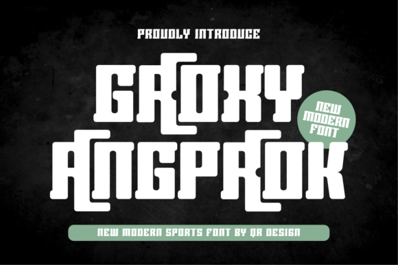
As a web and UI designer who ships dozens of landing pages, SaaS dashboards, and e-commerce experiences each year, I treat typography like infrastructure—not decoration. Groxy Angproak stands out because it delivers strong visual identity without sacrificing digital clarity. It’s a display font built for impact, not ornamentation: sharp angles meet smooth curves, generous x-heights support legibility at scale, and its confident rhythm holds up across devices and contexts.
Groxy Angproak isn’t trying to be neutral. Its personality is bold, cool, and unmistakably modern—ideal for brands that want to signal creative confidence without leaning into retro clichés or sterile minimalism. You’ll notice subtle geometric precision in letterforms like the uppercase A and R, balanced by open counters and consistent stroke contrast. That balance makes it work where many display fonts fail: on mobile screens, over image overlays, and in tight UI spaces like hero section buttons or product card headlines.
Where Groxy Angproak Earns Its Place in Your Layout
This font shines where hierarchy and tone matter most. Use it for:
- Hero section headlines—especially when paired with a clean sans serif (like Inter or Manrope) for subheadings and body text;
- Landing page CTAs—its weight and presence draw attention without requiring oversized padding or animation;
- Online store banners and category headers—it adds distinction to boutique fashion, design tooling, or wellness brands without feeling generic;
- Course sales pages and digital product launches—the font’s energy supports urgency and credibility simultaneously;
- Portfolio site titles and project cards—it frames creative work with intention, never distraction;
- Blog headers and newsletter graphics—particularly effective when used sparingly for section dividers or featured post titles.
It’s not meant for long-form reading or navigation menus. Groxy Angproak is a headline-first typeface—best reserved for short, high-impact phrases: “Launch Your Vision,” “Built for Creators,” “Join the Waitlist.” That restraint is what makes it powerful. Overuse dilutes its authority; strategic placement amplifies your message.
Readability & Responsiveness in Real Use Cases
On mobile, Groxy Angproak performs well down to ~28px at 400–500 weight—just avoid ultra-thin variants for small touch targets. For dark backgrounds, use the medium or bold weight with at least 10% letter-spacing to preserve character separation. On light backgrounds with image overlays, add subtle text shadow (1px black @ 30% opacity) to ensure contrast meets WCAG AA standards.
When used in buttons, keep labels under three words and pair with generous padding. Avoid stacking Groxy Angproak with other decorative fonts—it’s strongest when anchored by a functional companion. For example: Groxy Angproak (headline) + Inter (body and interface text) creates clear visual separation and supports fast scanning. For editorial or luxury brand sites, try pairing it with a warm serif like Cormorant Garamond for subheads—this adds depth while keeping Groxy Angproak as the dominant voice.
Practical Integration Notes for Web Designers
Groxy Angproak comes in multiple weights (Light, Regular, Medium, Bold), includes standard OpenType features like ligatures and stylistic alternates, and supports Latin-based languages including extended diacritics for French, Spanish, Portuguese, and German. Webfont files are available in WOFF2 format—optimized for fast loading and broad browser support. Always declare fallbacks in your @font-face stack and test rendering across Safari, Chrome, and Firefox.
For client projects and commercial websites—including online stores, SaaS platforms, and digital templates—verify the license covers web embedding, unlimited pageviews, and multi-domain usage. Most premium licenses include desktop use for mockups and presentations, but double-check if you’re bundling fonts into downloadable design assets or white-labeled tools.
Brand Tone, Trust, and Conversion Signals
Typography quietly shapes how users perceive competence and authenticity. Groxy Angproak communicates forward-thinking polish—not corporate rigidity or playful informality. That nuance matters on conversion-focused pages: a coaching site using Groxy Angproak for “Start Your 90-Day Transformation” feels both aspirational and grounded. An indie design tool’s pricing page benefits from its clarity in “Lifetime Access” or “Team Plan”—no extra styling needed to convey value.
Unlike script or handwritten fonts—which can unintentionally signal “casual” or “untested”—Groxy Angproak reads as intentional, crafted, and digitally native. That impression builds trust faster than aesthetic novelty alone. Users don’t need to “get” the font—they just feel its confidence, and that transfers to your brand.
Final Implementation Tips
Start small: swap Groxy Angproak into one hero headline, test contrast and spacing, then expand to secondary headings only if the rhythm holds. Avoid all-caps usage unless tracking is increased by at least 5%—its letterforms benefit from breathing room. For logo text, test kerning manually—some display fonts require fine-tuning to avoid awkward gaps between characters like “AV” or “To.”
If you’re building a brand kit for a client, include Groxy Angproak as the primary display font alongside two supporting typefaces: one highly legible sans serif for UI and body copy, and optionally one expressive serif or monospace for accent elements like quotes or code snippets. This keeps flexibility high while maintaining cohesion.
Groxy Angproak doesn’t replace system fonts or utility typefaces—it elevates them. When used with purpose, it becomes part of your design logic: a deliberate choice that strengthens hierarchy, reinforces voice, and quietly guides users toward action. In an ecosystem crowded with interchangeable aesthetics, that kind of intentionality is rare—and valuable.